
Keeping your finger on the pulse gives you the option of becoming an early adopter of emerging design trends and styles. This, in turn, can help you to deliver projects, whether your own or for your clients, that really pack a punch. Having a solid arsenal of web design tips to turn to when it’s time to get down to work can also help to speed up your workflow.
Even if you’re a bit of a maverick who prefers to walk your own path rather than following the herd, keeping abreast of the latest web design tips and trends has it advantages. For one, it’ll make it easier to understand the needs and wants of your clients when discussing their vision for a project and they want to emulate something they’ve seen elsewhere.
And if you really want to be original, being aware of what’s popular now will help you to avoid those trending web design tips and styles and create something that is all your own.
So in this article, you’ll find a collection of useful web design tips that will help your WordPress website and the client projects you work on in 2016 achieve success – whether you want to implement them or ignore them in your quest for originality.
12 Web Design Tips to Help You Achieve Success in 2016
When it comes to creating websites, whether for yourself or for your clients, success doesn’t come easy. To increase your productivity and keep your output looking fresh and modern, not to mention optimized for search engines and conversion rates, it’s essential that you’re always learning as many new tips and techniques as possible.So, let’s explore a few different web design tips that can help you out in 2016.
1. Use Style Guides
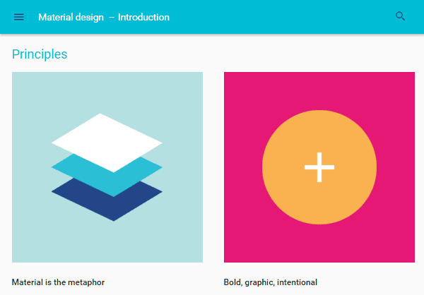
Create your own or adopt an existing style guide – image by Google
Web designers can create their own style guides to ensure the sites they build have uniform styles throughout. This is especially useful for designers who collaborate with other freelancers. A well-written style guide can help keep a disparate team on the same page.
The style guide Google produced for its own Material Design is a great example of a thorough, well-written style guide. If you’re looking for a more generic style guide or set of rules to apply to your work, be sure to check out our guide to the essential typography books for 2016.
2. Phase Out Sidebars
Maybe it’s time to reconsider the sidebar
Over time, it’s fair to say they’ve been hijacked by savvy marketers looking for a way to display email optin forms and other promotional content that doesn’t always offer much to the user experience.
While in theory sidebars containing links and other useful content should enhance the user experience, in reality, very few site visitors actually use them, at least according to heatmap tests conducted by ConversionXL. Therefore, compromising your site’s design in favor of a sidebar for marketing purposes may not deliver the results you desire.
Try phasing sidebars out in your designs, especially if a site doesn’t really need one. Make your content the most important element on a page by using designs that force readers to focus on it.
If the thought of abandoning sidebars altogether sounds a bit extreme, look for a theme that gives you the option of publishing full-width content, alongside more traditional layouts that feature an accompanying sidebar.
You can do a lot with the humble WordPress sidebar and one web design tip for 2016 is to get smarter with the way you do or don’t use them.
3. Start Your Designs Offscreen

Try starting your designs outside of the code editor – image by MoonRock / shutterstock.com
Instead of jumping right in and figuring things out as you go, why not turn to the trusty pencil and paper or use a whiteboard to plan an overall site layout offscreen first. Use this approach to get an idea of where you want specific elements to go, much like how an architect uses floor plans to plot out where windows, doors, and rooms should go.
If adopting a pen and paper doesn’t appeal, there are plenty of great wireframing and prototyping web design tools out there that can help you quickly get your ideas out of your head, before you get started in your development environment.
4. Use Larger Font Sizes

Experiment with large typefaces – image from mint.com
Readability on smaller screens, such as mobile devices, has played a huge role in this trend’s rising popularity, but it also fits in nicely with the ever-popular minimalist and flat design trends.
One web design tip for 2016 is to try incorporating larger font sizes in your designs, such as a minimum font size of 18 points for body text, where it makes sense. This includes any text you place in header images or even the text on a homepage when using a large, hero image. Just make sure you focus on choosing a web-friendly typeface that scales well, rather than agonizing about which size to choose.
5. Create More Space

Don’t fear the whitespace – image by grop / shutterstock.om
This space is typically referred to as “whitespace” or “negative space,”. However, this space doesn’t always need to be white, especially if you’re building a website that uses large images on its homepage and headers.
Minimize the amount of clutter in your designs and include more space around and between elements to help guide your users through your site. Whitespace can make it clear where a reader’s attention should be focused.
6. Responsive Design isn’t Optional

Are you ready for mobile first design? – image by MPFphotography / shutterstock.com
So one key web design tip for 2016 is to fully commit to responsive design. In the past, this simply meant checking off the responsive design box on your to-do list. However, as this technology matures, you need to start considering more than just fluid layouts. Think mobile optimized images, whether hamburger menus are the right choice, and much more.
For 2016, you might even want to embrace the concept of mobile-first web design.
7. Take Advantage of Google’s Material Design

Google’s Material Design is here to stay – image by Google
If you’ve embraced the flat web design trend, then it’s probably time for you to jump on the Material Design bandwagon and update your style for 2016. The core concepts of this web design framework include using layers to create elegant shadows alongside the edges of elements, helping to add some much-needed style and depth to the minimal flat design trend.
If you want to get started, there are some great, free Material Design UI kits around that can help get you up to speed.
8. Expand and Reevaluate Your Toolkit

Keep an eye out for new tools that can help you – image by Adobe.com
Just as new web design tips are emerging all the time, so too are new web design tools. From hot new free apps like Pixate, through to updates to industry favorites like the Adobe CC apps for web designers, it’s always worth keeping an eye out for something new that could help improve your workflow and enjoyment levels.
9. Simplify Navigation
Unclutter your menus – image by Titov Nikolai / shutterstock.com
Placing fewer items in your navigation menus and eliminating sidebars are great ways to cut down on the amount of clutter that exists on your site. This can allow you to build better-looking designs without compromising user experience or conversion rate optimization.
10. Up Your Imagery Game

Take your imagery more seriously – image by Fouaddesigns / shutterstock.com
The next level up could be to create or commission your own images from scratch, whether that’s going out and taking high-quality photographs, drawing them yourself, or a combination of the two. Combining typography with your chosen images can be another effective way to make them more original and assist you in delivering your message.
Choosing beautiful imagery for your website is a proven way to assist you in achieving your goals and help your content stand out from the crowd.
11. Phase Out Sliders
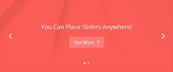
Are your sliders really adding anything to the user experience?
However, in most cases, they should really be phased out in 2016, especially if you want to decrease the amount of distractions on your site and make it easier for users to find their way around. Sliders don’t do either of those things. They’re very similar to sidebars. They create way too many options for your visitors to choose from, and very few people actually use them.
If it’s your homepage you’re concerned about, opt for a large header space that uses a unique, well-crafted static design that clearly defines your brand of that of your client. Again, play around with big typography to make static images more visually appealing and come up with better page designs that make sliders redundant.
12. Learn A/B Testing
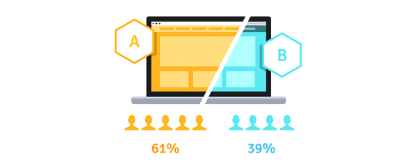
Validate your ideas with split testing – image by Iconic Bestiary / shutterstock.com
You also shouldn’t necessarily feel obligated to use or forego certain design elements simply because it’s a current trend or now an unpopular style. A/B testing is a skill you can learn to find out whether or not your designs are working or not.
Maybe you or your client want to use a slider or a busy sidebar and don’t want to give in to the conventional wisdom that states they’re outdated and ineffective. A/B testing is a great way to implement a new design and test its effectiveness yourself. Split testing is also an effective way to negotiate compromises between you and your clients, thanks to the evidence that can help back up your recommendations.
Check out our guide on how to use A/B testing with WordPress if you want to learn more.
Final Thoughts on Web Design Tip for 2016
Continuing to learn and pick up new web design tips, no matter how much experience you have, is one of the most important things you can do to achieve and maintain success throughout your career.Hopefully, these web design tips have given you something to think about and help point you in the right direction for more learning and experimentations. Perhaps the final web design tip should be not to rest on your laurels, no matter how successful your 2015 was.


Nice reading, I love your content. This is a fantastic and informative post. Keep it up and if you are looking for Faribault web design then visit v8web.com.
ReplyDelete